UX STUDY 1
Polaris UX Design Case Study
Users cannot get a birds-eye view of all their KPIs metrics in one place. Thus, users cannot easily track Gross and Net Sales Value, Gross Margin %, and Market Share. As a result, users cannot make changes to profitability levers without clarity using dashboard visualizations, scorecards, and reports. Lastly, users cannot configure metrics benchmarks, time duration, and currency. A new effective dashboard was needed.
UX/UI Need
Key metric-driven dashboard with the ability for users to configure data quickly
Role
Sr. Product Designer
Key Stakeholders
Product Owner (PO), Product Manager (PM), Subject Matter Expert (SME)
Business Analyst (BA), Development (DEV)
Personas
Pricing Analyst and Revenue Manager
Software Application
Insight Revenue Management Pricing Software
Design Tools
Figma, Sketch, Axure, JIRA,
Design Challenge
Creating a seamless end-to-end dashboard experience by using the design thinking methodology shown below. Collaboration with key stakeholders such as SMEs and POs to understand the legacy user flow where user pain points mostly occur within the user experience. More often than none, large data sets could not be shown thru effective visualizations, and key metrics needed to have a hierarchy for users to understand which were important primary versus secondary. Users needed a better user experience to configure metric benchmarks against current, previous, and custom time durations. This would create better visibility for Pricing Analysts and Managers to effectively manage profitability, and profit levers, which would add value to the overall health of the company the user couldn't see before. Thus, key decision-making could be conducted precisely, effectively, and holistically.
Empathize and & Define
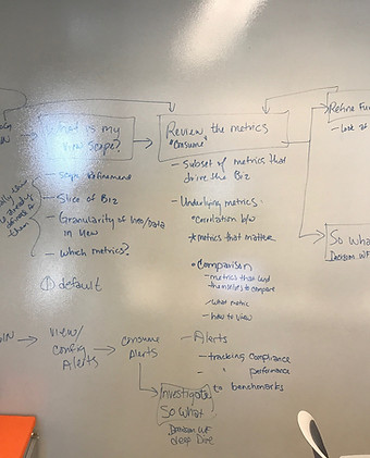
Identify, understand & empathize with your users. Start by working with your PM, SMEs, and BA to understand the users existing workflow and what design tools are needed for the future. Get in the war room and map out current user flows, user journeys, personas, details, find gaps, critically think, and identify user pain points.


Journey Maps
Are visuals documents that help understand where pain points a user is currently encountering. These help with building future user flows and confirming where changes are needed for the user.

User Flows
Let's take the design thinking findings, journey map and future user flow and start designing low fidelity wireframes.
Ideate & Prototype
Design ideas: Build low fidelity and hi fidelity wireframes and create prototype to support design ideas

Low Fidelity Wireframe
Using ideation points from design thinking session, I started building out the new improved dashboard based on the information architecture that was shared.
Design idea #1

Hi Fidelity KPIs and View by Configuration bar
In this visual, I focused on the View By configuration bar which was a very important design feature for the user to be able to change dashboard view. Also, designed 4 hi fidelity KPI metrics to show the health of the company to the user easily. Each KPI metric has the ability to benchmark durations and tell user positive or negative performance
Design idea #2
Visualizations and Secondary Metrics
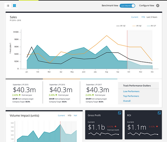
In this particular mockup, I changed my design approach and led with emphatic visualization and simplified the Configure Bar by adding a "Configure View" button to the far right. This will allow the user to control all configurations with a click a button and remove the complex control bar off the page. Now it can be a slide out window with all configurations for the user to make.
NOTE: Users wanted KPI metrics to lead the design since it provided the best visual aid in understanding the health of the company at a glance.

Design idea #3
FINAL


Final Design
In my final design, I went back to my original UX UI approach of KPI metrics leading the visual way. Now a user can focus on understanding the health at a very quick glance and which KPI metrics that need to be change. Below I balance the secondary metrics into 4 tab buckets which allows the user to easily navigate and see visualizations
Configuration Single Button
One of the major key design decisions is that I created a single button labeled "Configure Dashboard" that allowed the user to access a slide out window. This UX approach allowed the user to make all duration and benchmark configurations without it interrupting the key KPI metrics visuals and allowed more real estate for the user to understand the health of company with a large simplistic dashboard view. Less configuration clutter.
Configuration slide out window
Slide out window UX approach allows all the real estate and necessary configuration for the user to make. Each configuration is strategically placed for the user in three buckets; currency, current view, and Benchmark. Changing this configurations will change all metrics - primary and secondary throughout the dashboard allowing cohesive visual flow.
Sticky Header
I decided to create a sticky header which communicated to the user the dashboard configurations which were set and allowed the user to focus on the key scrollable content on the page.

